Indignity Vol. 1, No. 41: Unpacking the can.
NEW LABELS DEP'T.

Tin Pan Allies
WHILE TRANSFERRING A grocery delivery to the pantry last week, I was startled to see an unfamiliar label on a very familiar can of salmon. And whenever Indignity has questions about canned seafood, we turn to our indispensable fellow Substack newsletter Popping Tins, where editor Tim Marchman addresses all aspects, from the superficial to the fundamental, of the metal-encased bounty of the seas. Our conversation is below, in a special crossover presentation, for the readers of both publications.
Tom Scocca, Indignity:

Discuss the aesthetic, please.
Tim Marchman, Popping Tins: The thing people don't understand about the can of salmon you can get in any corner store in America is that it is high-quality fish, for most people the exact same fish fished from the exact same place as you'd get at a fishmonger who is laying out fillets of salmon on ice. When I was a teen we used to hear stories about guys who went out to Alaska to work on fishing boats and make enough money over a few weeks stint to go travel around the world for months, and one of my friends went out there and reported back that they were all true. One thing I learned from this is that most wild salmon you can get anywhere comes from those boats: They catch the fish and some of it goes into the cans and some is cut into fillets that you buy frozen wrapped in plastic and some is cut into fillets that are frozen and then thawed so that you'll buy them on ice at the store. They're all the same stuff; the questions are about money and presentation.
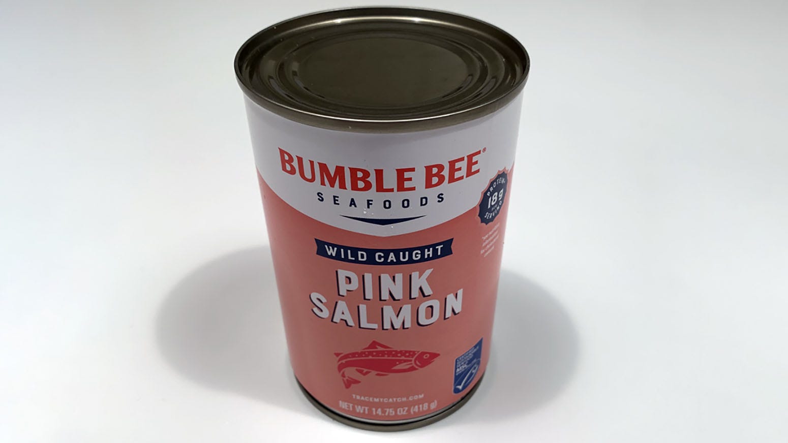
Indignity: And this, from a new load of groceries, is a dramatically new presentation. What do you make of Bumble Bee’s new approach here? What is it trying to tell the consumer of canned fish?
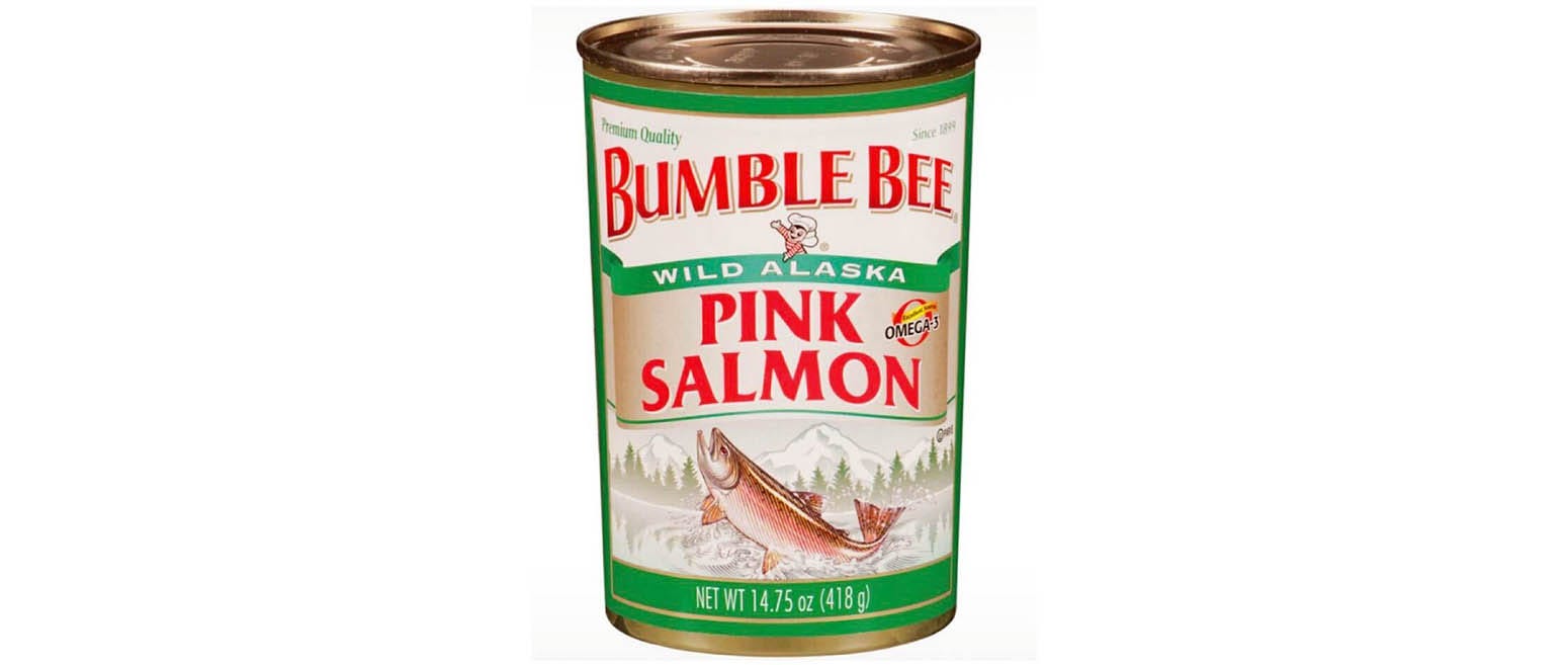
Popping Tins: First, I'm looking at the old label. Here I see the mountains and the cool water of Alaska. I can feel the crisp air into which the salmon is leaping. That, and the prominence of the words "Wild Alaska," tell me that Bumble Bee is telling the prospective purchaser that this is fresh fish with pink-orange flesh, not fish grown in a weird farm where parasites live on it and that has to be dyed because its cannibal diet has turned its flesh grey.

I also note the emblazoned OMEGA-3 logo. I don't know what these oils do, exactly, but I do know they're understood to be good, especially for the brain, and that salmon has lots of them. Bumble Bee is communicating that this fish is good for you—that it's healthy and will contribute to your well-being. This is true; its wild-caught fish, packed pretty much straight from the water, are a healthy and economical choice.
What I can't figure out is whether this would convince the prospective purchaser who's thought less about canned fish than I have, or come off as sweaty and try-hard. I don't want to balance my judgment of their packaging against the takes of a hypothetical and nonexistent consumer I haven't talked to. But I wonder if this label doesn't come off as deceptive, because people are so used to being lied to that packaging and presentation are assumed to be fraudulent, and so claims that you're selling a wholesome product convey that you're not doing so. How to convey that your claims are accurate when they're accurate is a fish-packaging problem I'm glad it's not my job to solve.
Indignity: So now they've stripped out all that natural landscape imagery for this minimalist and schematic new treatment: stamped-looking red fish, solid salmon-colored background, highly prominent "WILD caught" badge? Just the slightest drop shadow on the white lettering. I thought for a minute this was one of those times when a delivery outfit sends you a food-service package instead of the regular shelf-bound consumer version, but it seems to be real. What do you suppose the reasoning is behind the change?
Popping Tins: I can't speak to reasoning here, but the fundamental irreality of the packaging seems consonant with what it is in the can, and the consumers' relationship to it. I don't especially like the formulation where you say some old-timey thing was the original of some modern thing, but salmon boats are clear predecessors to modern ghost kitchens: The fish all gets caught and packaged in the same place and is just presented in different ways for different market segments. One kind of can is for the dollar store, another is for the boutique, even if it's the same product.
What draws my attention here isn't so much the fonts as the change in color scheme. Previously, we had one heavy on green, which connotes ecological awareness and health. (I'd be interested to see if previous iterations of Bumble Bee canned salmon through the decades focused on green, or if they used other colors—blue, for example, to represent the clean waters in which these salmon lived.) Previously, we had one that emphasized the health of OMEGA-3 oils. Previously, we had one that pointed to the land, the air, and the water.
Now we have a can that looks like the generic products in Repo Man, with a color scheme that represents the color of the fish's flesh—appetizing in reality, less so when presented as part of a can alongside a stylized fish. Note also that the new can emphasizes protein content over oils. This is presumably a nod to the fish-buyer who's attempting to live as a Paleolithic hunter-gatherer.
An important thing to note here is the blue badge on the new can, which I believe connotes that an authority of some sort has said that the fish has been responsibly caught and won't poison you. This move toward ecology and health being divorced from the imagery of cold water and crisp air is interesting from a marketing perspective.
Indignity: Does this graphic approach remind you of any other brands competing for newly enthusiastic canned-fish buyers?
Popping Tins: It seems to be approaching the austerity and reserve of a brand like Ekone, which offers nothing more than high-quality oysters in a can and has packaging reflecting that, without quite getting there.
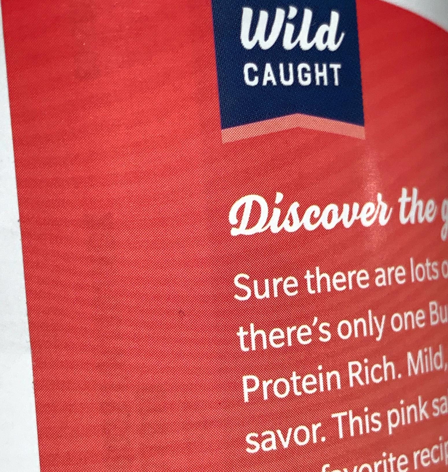
Indignity: Yes, it reads maybe more like flat design, like a can of salmon that a circle-headed figure would be holding inside their cutaway apartment on a subway poster advertising some app. Given those associations, it can't help coming across as one more extremely late-arriving dose of Millennial Pink. Although when I look at the label again, in stronger lighting, I realize that the pink surface is not totally undifferentiated: it has faint wavy lines running through it in a visually subtle but incredibly literal representation of the grain of salmon flesh.

It's very odd not to have the little Bumble Bee there. The old label was a bizarre hodgepodge of gradient shading and a fish that looked as if it were leaping out of a Wall Street Journal hedcut stipple illustration, but it all served to tell me that a giant corporation was on the job to deliver me exactly what I had come to expect from it.
I still do associate canned salmon with being the fancier and less regularly bought product than canned tuna, but mostly now it's a crucial piece of the standard household inventory. A single can with some combination of finely chopped celery, bell peppers, and/or scallions, plus a handful of chopped nuts, plus brown mustard and some mayo, and there's lunch for four people when I'm otherwise out of ideas.
Popping Tins: Now that you mention it, the Cronenbergian flesh-grain on the can is an odd touch. Is it meant to represent that the can itself is flesh, disgorging more? I'm confused.
I come back to my question about the original packaging: Does the accurate packaging, depicting healthy food caught in a pristine environment, signal to the purchaser that the food is in fact unhealthy and to be avoided? If so, the new, more generic packaging, by signaling that the food is mysterious and possibly part of some sort of Instagrammable setup, may signal that it's healthy and to be enjoyed. I like it less, but I can see it being effective. And I hope it is: the humble can of salmon really is one of the best deals anywhere in the supermarket, not only good for a really excellent salmon salad that's a nice change of pace from tuna salad, but also good for croquettes and stews and fillings in things like pies and empanadas. Whatever's on the can, it's in my pantry.


