INDIGNITY VOL. 3, NO. 83: Brand awareness.
ADBUSTERS DEP'T.

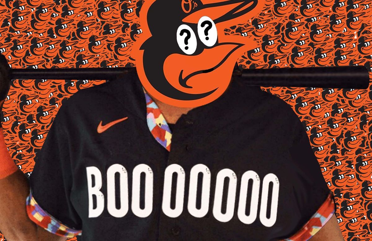
How Can You Tell What City a Baseball Team Is From?
THERE WASN'T ANY way I was going to like the new "City Connect" uniforms that Nike came up with for the Baltimore Orioles. The City Connect scheme, like the City Edition scheme Nike came up with for the NBA, is a pure merchandising ploy, putting teams in uniforms completely unrelated to their normal uniforms, so the fans have a whole other line of jerseys and caps to buy. It's silly and greedy, and it fundamentally reflects the upside-down relationship the sports leagues have allowed themselves to fall into with their uniform manufacturers—while rolling out these new alternate uniforms, Nike also issued a diktat that teams would be barred for using more than four of whatever other uniform designs they already had, leading the Seattle Mariners to abandon their basic normal road grays. Counterproposal: how about you just shut up and run the sewing machines?
Because I am a reactionary who thinks the Houston Astros should never have stopped wearing rainbow stripes and playing in the Astrodome, City Connect was never going to be for me. But even people who had wanted to be excited about City Connect hated the Baltimore uniforms. The jerseys are black with slightly distressed plain white block lettering; the hat is black with a white script B. A multicolored print that's supposed to represent the vibrancy of the city's different neighborhoods is hidden inside the lining of the sleeves and body, and on the socks. It's bland and also weird; the t-shirt jerseys for fans appear not to even have the lining, so they're just black t-shirts.
Nike's official explanation of the concept was grimly backhanded: the drab outside "represents a 'surface-level view' that some may have of the city"—the rot on top of the glitter, to reverse the old Morris Goldseker Foundation warning about Baltimore. What could boost civic pride more than to have a bunch of marketing people from Beaverton, Oregon, tell you that your city is ugly and has a bad reputation?
The botched high-concept symbolism does, however, point to the basic mistake behind the entire City Connect idea. By putting a fogbound Golden Gate Bridge on the San Francisco Giants jersey, or by decking out the Boston Red Sox in the blue and yellow of the Boston Marathon, or by abstracting the Baltimore neighborhood map into a Funfetti lining, Nike is trying to make the uniforms conjure a sense of civic identity. But the simplest visual shorthand for Baltimore is...an Orioles cap.
Baseball uniforms already are the most well-known municipal iconography around! TV and movie costume designers don't dress a character in Marathon blue and yellow to show they're a Masshole, they just slap a Sox cap on their head. Why would you make a Yankees cap that looks like the Statue of Liberty or a yellow cab, when everyone instantly associates the existing Yankees cap with New York? The shape of the white script B on the Orioles City Connect cap, the release announcement explained, was borrowed from the orange B on the team's regular road jersey—the B that comes at the beginning of the word "Baltimore." The new uniform's special tribute to the city is lifted straight from the normal uniform.


WEATHER REVIEWS
New York City, May 23, 2023
★★★★ Once again the forecast got shaved down as the day went on, from 70 into the 60s. A hum of activity carried through the bedroom window, intimations of the wider world spreading out around a morning nap. The smoke-glare was in the sky again. People wore light jackets over spring clothes. The afternoon light found its way along the blank wall between apartment buildings and cut deep into the cross streets. Plain brick facades shone above the cab mired in traffic. Shadows of pedestrians stretched across the unmarked, scarified pavement where the crosswalk belonged. The angle of the late sun made the individual stones bulge out from the wall along the Central Park transverse, and particular weeds among them stretched into their own spotlights. A red Ferrari and a red pedicab waited side by side at a stoplight on Central Park West.
EASY LISTENING DEP’T.
INDIGNITY MORNING PODCAST
Indignity Morning Podcast No. 74: A stillborn feature on a dying website.
Tom Scocca • May 24, 2023
Listen now (3 min) | The Indignity Morning Podcast is also available via the Apple and Spotify platforms.
Read full story →
SANDWICH RECIPES DEP’T.
WE PRESENT INSTRUCTIONS for the assembly of sandwiches from More Recipes for Fifty, by Frances Lowe Smith, published in 1921, found in the public domain and available at archive.org for the delectation of all.
PEANUT AND RASIN SANDWICHES
Mix together equal quantities of peanut butter and ground raisins; add about an eighth as much softened butter. Spread slices of rye, barley, or entire wheat bread, and put together in pairs. Quick bread not sweetened with molasses may also be used.
MARMALADE SANDWICHES
Spread bread with softened butter or margarine. Put together with stiff orange, apple, peach, or pear marmalade.
FIG SANDWICHES
Chop stewed figs fine, add lemon juice if desired; spread on buttered brown bread.
FRUIT SANDWICHES
Put stoned prunes, seeded raisins, stoned dates, and figs through meat chopper. Add about one-fourth as much finely chopped walnuts as fruit mixture. Moisten to paste with orange or other fruit juice. Put between slices of buttered rye or entire wheat bread, with or without a layer of cream cheese.
If you decide to prepare and attempt to enjoy a sandwich inspired by this offering, kindly send a picture to us at indignity@indignity.net.
MARKETING DEP'T.
Thanks for reading INDIGNITY, a general-interest publication for a discerning and self-selected audience. We depend on your support!